Stacking the bars in your favour!
A stacked bar chart does much the same job as a regular or clustered bar chart in that it enables comparisons of size, but is preferable when your data has multiple part-to-whole relationships. They pop up quite frequently in ONS bulletins, so I want to talk about best practice and common pitfalls so we can start stacking the bars in our favour!
As with any chart or method for displaying data, there are no concrete rules, just principles to keep in mind. I’d like to run through some of these principles to give you an idea of good and bad practice.
Principle 1: Recognising when you have too much data
Probably the most common problem with our stacked bar charts is that we tend to cram too much data into them. We fall into this trap believing that to show all of our data at once is somehow more transparent and can’t possibly be misleading. What we are actually doing is creating visuals that are less useable and don’t achieve their purpose. So how do we know how much is too much?
A good rule of thumb would be no more than three or four bars in a stack. Any more than this and it can quickly become untidy and much harder to interpret – and that’s before we take into account the accessibility problems with using five or more colours!
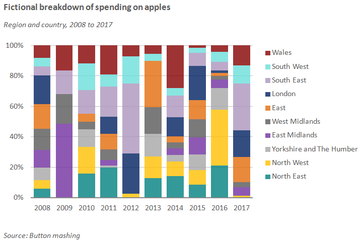
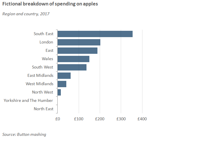
The following fictional offender is a very common example of a chart of this type that we see all too often. Put yourself in a user’s shoes. Can you describe the trend in the East at a glance? Or can you accurately estimate what share the South East had in 2012 quickly?
So how can we improve this chart for users?
Try combining like-categories or categories less important to the story. Are there some categories that haven’t undergone change? Are there some that are consistently small and less noteworthy that you could simply remove to enable a different charting strategy? Think about these questions. They could turn a busy, inaccessible chart into something insightful.
We can also use multiple single bar charts. Do we have to stack them? Maybe splitting them out into multiple mini charts, each comparable and much simpler to use, can help our message.
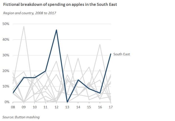
Alternatively, try using a line chart to pick out important categories and reduce noise. It’s OK to take the more interesting or important stories and plot them on a line chart, with everything else as context. Would the following example be easier to interpret if our focus was on the South East?
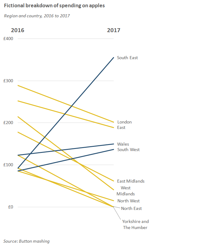
Another elegant solution (and under-appreciated one in my opinion) is a slope chart. We can show change over time and the magnitude of categories in equal measure with this clean and simple chart. Just be sure to label things as directly and tidily as possible when drawing a slope chart.
One final thing to consider is whether or not we really need a time series. Is the inclusion of historical context detracting from a user’s ability to see what’s going on now? Take the apple example again. Could we just look at the final year in isolation with a simple ranked bar chart?
Principle 2: Not all data lends itself to a stacked bar solution
Having what seems to be appropriate data (that is, three or four parts comprising a whole by different categories or a time series) still doesn’t guarantee you a good stacked bar chart. It can all depend on the subtleties of your numbers. Erratic changes in the data don’t work so well, whereas smoother changes or differences make for a more successful stacked bar chart.
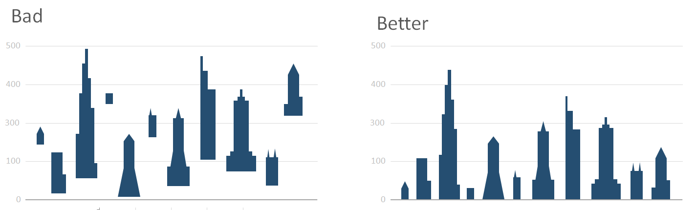
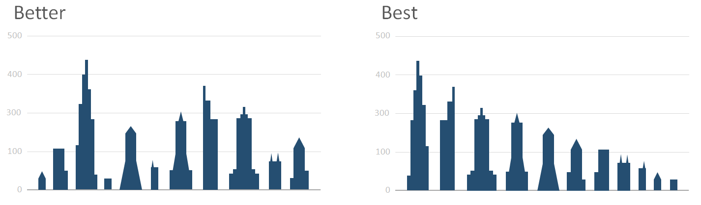
This is mainly due to the lack of a “common horizon” between like-bars. The following examples illustrate and compare building heights with varying success. You wouldn’t consider presenting building heights on a chart, each with a different base. It makes it harder to compare heights and makes no sense to do so. But this is exactly how middle categories appear in stacked bar charts. You can clearly see the improvement that the second chart has made over the first, anchoring each building to the ground so that the differences are clear, putting less of a burden on the reader.
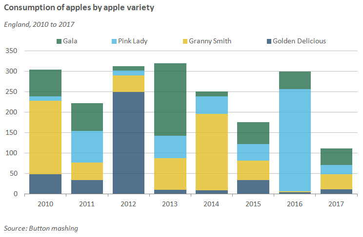
The following chart does a great job of displaying the total consumption of apples over time, but in breaking the data down by apple type, it shares the same problem as the floating buildings. It’s hard to truly comprehend the changes for any apples other than Golden Delicious because they are erratic and lack a common horizon. Try tracking the consumption of Pink Lady apples through time. Was it higher in 2014 or 2015?
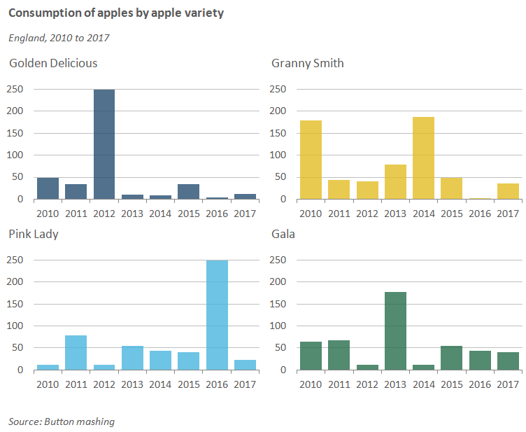
We can solve this problem by using multiple single bar charts. Try splitting categories out into multiple mini charts, each comparable and showing their bars from a common horizon. We have, of course, taken the focus away from the total consumption of apples by presenting the data in this way, but there is nothing stopping you charting total consumption elsewhere. Whichever method you choose has its compromises, and should depend on which story you want to focus.
Principle 3: Ordering and ranking matters
As we’ve mentioned, erratic data doesn’t work well, but there may be more we can do to help our charts without using a different approach completely. Look at the following example of our building heights chart. We’ve now ordered it from smallest to largest.
If you were to draw this chart from scratch, you’d likely opt for the largest to smallest method with barely a thought. We’ve ordered them by height and grounded them to a common horizon so the reader immediately gets the message. However, when we produce stacked bar charts, this common sense approach is often overlooked.
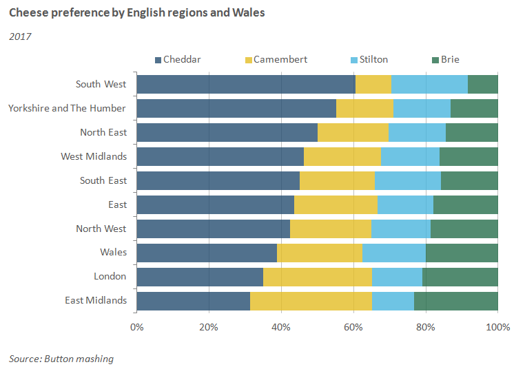
Now let’s look at how ordering can directly improve the usability of a stacked bar chart. The following fictional chart shows cheese preference by English regions and Wales, and uses the standard ONS ordering for regions.

By simply ranking the areas by Cheddar (the most dominant category) from highest to lowest, it has significantly improved our charts readability. We’ve now gone away from the standard ONS ordering for regions, but it’s OK to break conventions like this if it genuinely helps convey your message.
A consistent geography order may be a good thing for reference tables, but where charts are concerned, displaying our story effectively should take priority!
Principle 4: Nothing is certain
So far we’ve spoken about some of the main pitfalls and instances of bad practice, but there are sometimes exceptions where, for good reasons, we can go against these principles. We’ve spoken about the lack of a common horizon and how that leads to difficulty interpreting the categories sandwiched between the top and bottom bar segments. But does this always need to worry us?
The following chart plots sales of newly built houses by type over time. It’s hard to see the changes in semi-detached and terraced properties, but in reality they are pretty consistent and are secondary in terms of interest. Detached properties and flats saw far more change and are positioned at the top and bottom of the chart, so the user can clearly see the priority messages. This goes to show that where charts are concerned, there are no rules, just principles to keep in mind.

Hopefully I’ve managed to get you thinking about your stacked bar charts and how best to apply them, or consider alternatives in the future.
Happy charting!