Are you a user of flow of fund data? What interactive features are helpful in your work?
New flow of funds data was published this morning. Alongside the main release are four interactive products which each look at the data in a different way. We’re appealing for feedback from you, our users, to let us know what is useful. Please contact us via FlowOfFundsDevelopment@ons.gov.uk if you’d like to inform future products.
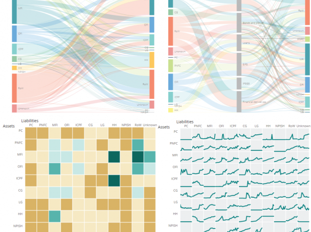
In 2016 an interactive sankey diagram was developed and included in the Economic Statistics Transformation Programme: the UK flow of funds project: identifying sectoral interconnectedness in the UK economy. The main aim was to visualise the interactions of sectors within the economy through their financial instruments and identify which sectors hold assets and liabilities in particular instruments, without having to refer back to the rather large data tables. However, it had limitations: only one year at a time could be viewed, making it difficult to spot changes over time, and because the size of each interaction is represented visually, changes in the smaller and less visible interactions are harder to spot.
With these limitations in mind, this year I worked with the flow of funds team to ascertain which relationships were most important and how we could improve upon the existing sankey interactives. We think that users of the data are interested in looking for changes over time and this definitely needed to be prioritised. We also understood that the ability to spot where small interactions between sectors are changing was of importance, making us keen to have a way of focussing in on these smaller interactions that may previously have gone unnoticed.
Hence, the following the interactives were created:
The original sankeys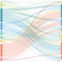
A few tweaks were made to improve usability, the code was altered slightly to preserve the order or sector when another year was selected and tooltips were also added to each interaction, sector and instrument to enable comparisons to show how each have changed over time.
Descriptions of sectors and instruments were also made more user friendly:
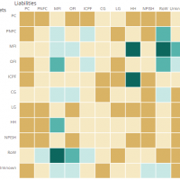 Heatmap
To try and highlight that some sectors have more financial holdings compared with other sectors we experimented with visualising derived variables in the form of a heatmap.
Before settling on “interaction as a percentage of the total” we visualised totals, the difference year on year for the totals, the % split per transaction (in order to include the transaction data somewhere) and % split differences. The final heatmap aims to draw attention to areas where relationships have the largest percentage of holdings compared with other asset sector to liability sector relationships.
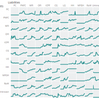 Small multiples
The small multiple interactive aims to give users an overview of all the data, focusing particularly on change over time. After plotting the data on an equal scale we realised that a lot of detail was being missed. By including the ability to rebase the scales of each chart to a sensible range for the data being plotted we enabled users to get a better idea of where most change was occurring. Clicking on a small multiple also zooms in to focus on that particular chart, including gridlines – useful if someone wants to read off values from the chart.
How are you using these graphics?
Hopefully it’s clear that each of these interactives has a slightly different purpose. However, we’re really keen to hear back from our users on which features you use or whether there is something else that would allow you to more clearly use flow of funds data for your own purpose.
Please email FlowOfFundsDevelopment@ons.gov.uk with your comments. We’d love to hear your thoughts and perhaps build them into our interactives next time around.