Helping users get what they need from ONS bulletins
For the past 12 months or so, the search term “gender pay gap” has consistently been one of the most popular searches on the ONS website. We publish commentary on data about the gender pay gap each year, yet 40% of people who ran that search left the website without clicking any results.
Why? One reason could be that the content those users were looking for sat halfway down a page titled “Annual Survey of Hours and Earnings: 2017 provisional and 2016 revised results”. Perhaps people were unable to make the connection between the topic they were interested in – the gender pay gap – and the survey that the data about that topic came from – ASHE.
People are interested in topics, not the places that the stats come from
Last week, we released new data from the Annual Survey of Hours and Earnings (ASHE), but this time the data was accompanied by three short statistical bulletins, titled:
By writing our analysis to fit topics that we know people are interested in, we’ve made it easier for people to find that content. In fact, on release day, there were 77% more visits to the three bulletins than to last year’s ASHE bulletin.
This ASHE release reflects a huge amount of work by the brilliant team behind the bulletin, working collaboratively with Digital Publishing. It is also the first milestone in a big user-led design project that the website team have been doing around bulletins.
Structuring content around tasks helps people get what they want more quickly
If you visit any of those three topic-based bulletins, you may also notice that the content on the page is structured differently. Broadly, the sections of the bulletin are split into:
- analysis of the data
- getting to the data
- using the data
- finding more content about, or related to, the subject
This reflects research and testing we have done with users which showed that, broadly, different users tend to have one or two of those tasks in mind when they visit bulletins. In the past, content about these different things has tended to be more integrated, and structured under headings which don’t make it entirely clear to users what they should expect to find.
Our testing also found that where there’s a lot of content, users find it harder to scan the page and to identify the content they’re looking for. Generally, when writing for the web, shorter is better. The new structure makes it easier to do this.
We ran a poll on the new-style ASHE pages to ask how easy users found it to find information on the bulletin. Of the 181 responses so far, 85% of people said yes.
A new look for bulletins
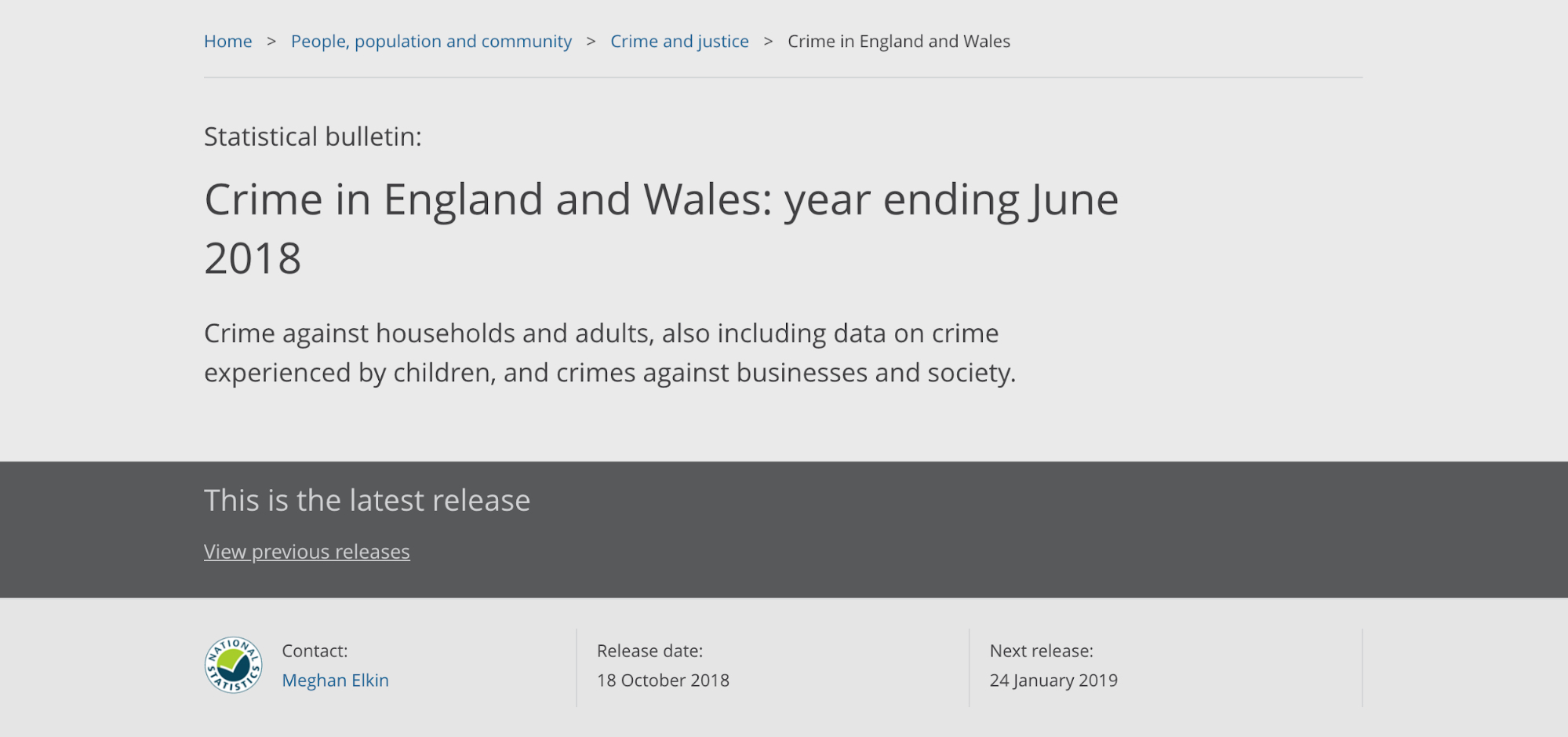
Alongside the content changes, we’ve been working hard to improve the bulletin design. This week we’ve made some small changes to the website that help to put the content first. The first change is to the page header – the block that appears before the main content starts.
We’ve reduced the overall height and visual clutter (stripes and borders) to make the design simpler and prevent it from getting in the way. On desktop screens, the page header is now around one-third shorter.
Despite making it shorter, we were still able to make the key content elements (title and summary) bigger. These changes, combined with a bold title and underlining all links, help to improve the usability and readability of the content.
The breadcrumbs (the links above the title) have been neatened up too. This is most noticeable on smaller screens, where the breadcrumbs have been collapsed to only show a single link back to the parent page. This helps to reduce the number of page elements getting in the way of the content.
Lastly, the banner that tells users “this is the latest release” has been reduced in size and prominence. This information is very important to users, but the old big, grey version was proven to discourage people from scrolling down the page.
Before
After

The pilot continues
For now, we’re still in the learning stages of this project – we’re not ready to roll out these structural changes to the majority of ONS bulletins yet. We’re going to continue working with a small number of output areas, testing and improving our understanding of how these changes should be applied.
We’re also learning about the impact this approach has on the people who write our bulletins – we appreciate that it doesn’t necessarily take less time to use fewer words, and isn’t realistic to expect teams working to tight deadlines to change their processes without careful planning. We’re creating guidance and reviewing the impact on writers to make sure we’re confident about this before making wide-scale changes.
Of course, there are still principles we can apply in the meantime. There’s always room to shorten, simplify and prioritise content to meet user needs.