Dueling with axis: the problems with dual axis charts
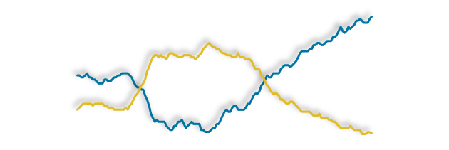
Charts with two different y-axis are often used in the reporting of statistics. They can display two or more related…
Read more on Dueling with axis: the problems with dual axis chartsCharts with two different y-axis are often used in the reporting of statistics. They can display two or more related…
Read more on Dueling with axis: the problems with dual axis chartsA stacked bar chart does much the same job as a regular or clustered bar chart in that it enables…
Read more on Stacking the bars in your favour!The principles and guidelines from part1 showed what data best suited a pie chart, solutions for labelling and using colour….
Read more on The humble pie chart: part2We’re in an art gallery…… but there are no paintings on the walls. The paintings are just described to us….
Read more on Should tables be off the table?A strategy for choosing the right chart. So far we’ve covered a lot of charting tips about using your axes…
Read more on In a relationship – it’s complicatedI recently wrote a blog post about axes on line charts starting at non-zero values. However, bar charts are a…
Read more on Does the axis have to start at zero? (Part 2 – bar charts)At the risk of ruffling a few data vis feathers … no? But there are often occasions when it should….
Read more on Does the axis have to start at zero? (Part 1 – line charts)…to its full potential Last year we launched a data visualisation best practice section on Style.ONS.gov.uk. In an effort to…
Read more on Use your y-axis