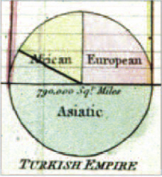
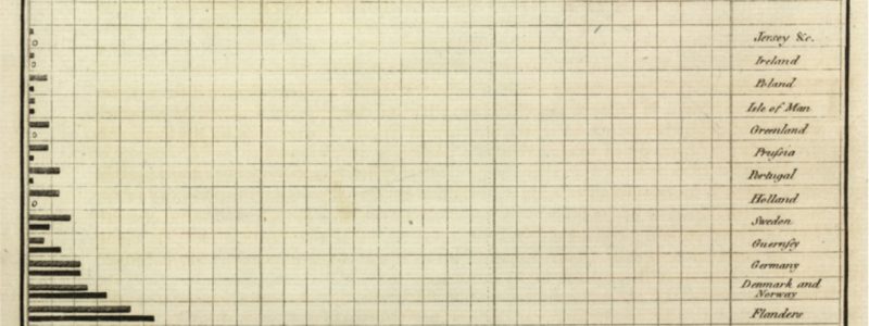
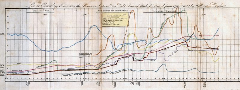
Stacking the bars in your favour!

A stacked bar chart does much the same job as a regular or clustered bar chart in that it enables…
Read more on Stacking the bars in your favour!
A stacked bar chart does much the same job as a regular or clustered bar chart in that it enables…
Read more on Stacking the bars in your favour!
The principles and guidelines from part1 showed what data best suited a pie chart, solutions for labelling and using colour….
Read more on The humble pie chart: part2
I recently wrote a blog post about axes on line charts starting at non-zero values. However, bar charts are a…
Read more on Does the axis have to start at zero? (Part 2 – bar charts)
At the risk of ruffling a few data vis feathers … no? But there are often occasions when it should….
Read more on Does the axis have to start at zero? (Part 1 – line charts)The following blog post is written by Rob Davidson. Open Data Day has been again! Hundreds of events with thousands…
Read more on Open Data Day 2016Now is your opportunity to be part of leading examples of digital development within government. ONS is committed to improving…
Read more on We’re recruiting!It’s been a bit quiet from much of the Digital Content side of Digital Publishing division over the past few…
Read more on The big end of year Digital Content wrap up [Part 1]Today, 15th January, sees the public beta launch of Visual.ONS, our new companion to the ONS Alpha website. Why two sites? A…
Read more on “Official data, new light” – introducing Visual.ONSI can be a little bit sceptical about conferences; perhaps I’m scarred from years of attending statistically focussed events where…
Read more on Cats, “it depends” & invisible visualisation