Embedding ONS interactives in your website
Here’s a simple guide to embedding our interactive maps and charts and making them responsive, so they look their best…
Read more on Embedding ONS interactives in your websiteHere’s a simple guide to embedding our interactive maps and charts and making them responsive, so they look their best…
Read more on Embedding ONS interactives in your websiteWhen writing publications for our website, our analysis teams are often keen to show as much of our data as…
Read more on Why less interactivity can be moreIn December 2019, the Intellectual Property Office (IPO) in Newport hosted an amazing week of service design-related events. The week…
Read more on A Week of Service Design in Wales
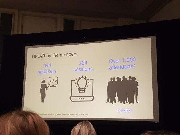
In March I was fortunate enough to travel with a colleague to Chicago to participate in the annual NICAR (National…
Read more on Bet your bottom dollar, you’ll lose the blues in Chicago
Three years ago, the Office for National Statistics (ONS) decided to start an experiment.
Read more on Three years of Visual.ONS – what we’ve learned
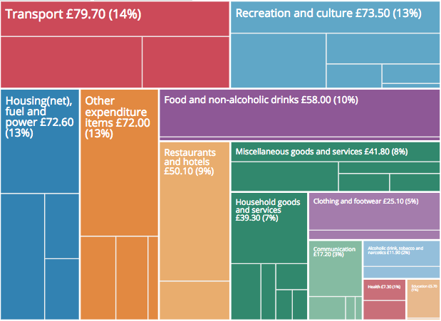
The 2017 Family Spending data was released today. For the past three years the bulletin has been accompanied by an…
Read more on How to customise an embedded interactive
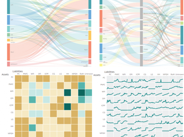
New flow of funds data was published this morning. Alongside the main release are four interactive products which each look…
Read more on Are you a user of flow of fund data? What interactive features are helpful in your work?It’s been a bit quiet from much of the Digital Content side of Digital Publishing division over the past few…
Read more on The big end of year Digital Content wrap up [Part 1]Post by James Bayliss, Digital Content Design is not just what it looks like and feels like. Design is how…
Read more on User testing our interactives