What’s French for data visualisation?
Conferences are a great way to learn and view the wider field of your profession. Often in data visualisation, you…
Read more on What’s French for data visualisation?Conferences are a great way to learn and view the wider field of your profession. Often in data visualisation, you…
Read more on What’s French for data visualisation?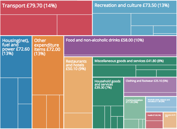
The 2017 Family Spending data was released today. For the past three years the bulletin has been accompanied by an…
Read more on How to customise an embedded interactive
You may have seen in June last year we asked people to draw the rest of the line, for several charts,…
Read more on Reusable visualisation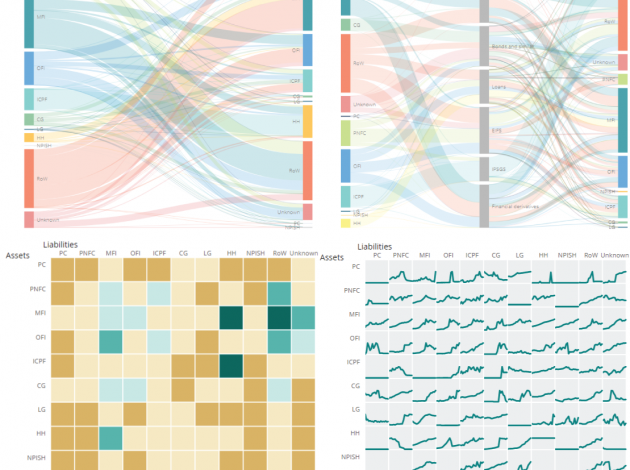
New flow of funds data was published this morning. Alongside the main release are four interactive products which each look…
Read more on Are you a user of flow of fund data? What interactive features are helpful in your work?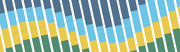
A stacked bar chart does much the same job as a regular or clustered bar chart in that it enables…
Read more on Stacking the bars in your favour!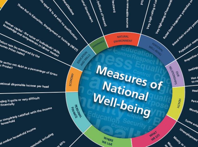
In 2010 the then-Prime Minister David Cameron launched the Measuring National Well-being (MNW) programme to “start measuring our progress as…
Read more on Reinventing the Wheel
The principles and guidelines from part1 showed what data best suited a pie chart, solutions for labelling and using colour….
Read more on The humble pie chart: part2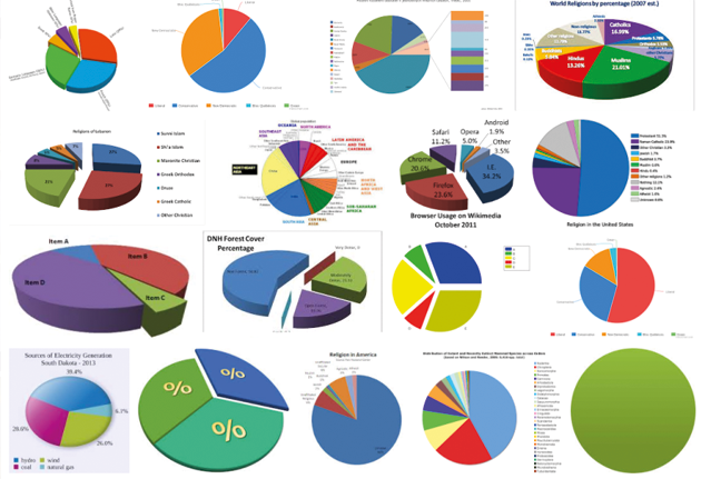
A blog on pie charts? surely everyone knows how to use them. Just googling “pie charts” and hitting the “images tab” in a browser gives us a fair indication… people in general don’t, and the results are worryingly bad.
Read more on The humble pie chart
Well then. As is only right and normal at the end of a year, it is time to look back at a year in the life of Digital Publishing. It has been a big year for us here in ONS. We launched our new site in February. We also saw a bunch of people move on to new projects and recruited some very talented people to help us ensure we continue to improve everything we do.
Read more on A year in the life of Digital PublishingA couple of weeks ago I attended the Graphical Web 2016, a festival of graphics, data and general geekery hosted…
Read more on Graphical Web 2016