What’s wrong with the way we publish data?
Most users come to our site with a question, for which they believe some data is the answer. The best…
Read more on What’s wrong with the way we publish data?Most users come to our site with a question, for which they believe some data is the answer. The best…
Read more on What’s wrong with the way we publish data?Here at ONS, we’re doing a lot of work on our statistical bulletins – the pages we publish alongside new…
Read more on Writing about statistics: why is shorter, better?
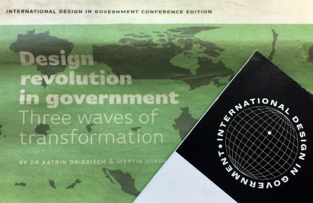
A round-up of day one at the International Design in Government Conference, by Matt Weeks. This July I attended the…
Read more on International Design in Government Conference: Day One
As you may have seen from Darren’s blog post, we are focussing on redesigning our statistical bulletins. To kick-start this work,…
Read more on Redesigning bulletins (my first, and Benjy’s second, Design Sprint)Conferences are a great way to learn and view the wider field of your profession. Often in data visualisation, you…
Read more on What’s French for data visualisation?What does this image look like to you? It’s actually the quarterly Crime bulletin from January this year. As part…
Read more on Bulletin development – making pages ‘easier to read’
Make data part of the web We have it written on stickers, we have it in our open data principles…
Read more on Why we have produced a Beta version of a new ONS APIThis is a companion post to the one Andy has published outlining ‘why’ we have built the API, and a…
Read more on Using the new Beta ONS APIStatistical bulletins are a critical part of what we do at the ONS. They are read by more people than…
Read more on Making better bulletins – let’s start with what we knowThis is the final post in our short series on using data for content design at ONS. My first blog…
Read more on How we’re using data dashboards for content design at ONS